The Anatomy of the Perfect SaaS Analytics Dashboard
You want to create a SaaS dashboard to help your team focus on what matters — converting more customers and building a great product and customer experience to retain more of them.
There just always seems to be something in the way of dashboards truly being a difference-maker. The dashboard tool doesn’t have all the necessary data source integrations. The visualizations don’t inspire action. In some cases, your team may not even know where to find your dashboard.
The perfect SaaS analytics dashboard can provide a huge impact on team focus and achieving goals faster. But only if you focus on creating a dashboard that presents clear and actionable insights for your specific business and you have a plan for leveraging it.
This post will dive into exactly how to do this and how you can avoid pitfalls that make so many dashboards ineffective.
All Your Data Integrated, Unified, and Enriched
Dashboards are only as good as the data they’re using. Today’s SaaS companies pull data from multiple customer touchpoints within and outside their apps. Insights across these channels are vital for understanding important metrics along the customer lifecycle.
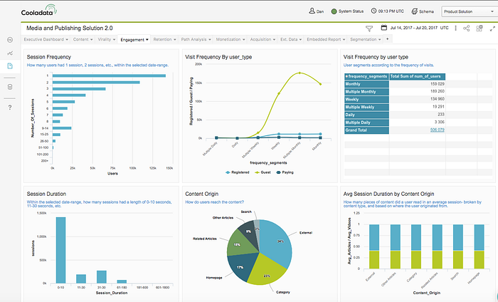
Dashboards can highlight important company metrics in visually appealing ways
Visualizing these metrics is the true potential of analytics dashboards. Too often, however, company dashboards don’t offer a complete picture because they rely on incomplete data.
To create the perfect SaaS dashboard, you need to have the data manipulation capabilities to make one possible. Specifically, your SaaS analytics tools should be able to do the following:
Handle Data from Any Source
SaaS companies already rely on established technology stacks for pulling in customer data. Yet not every analytics tool integrates with every technology. The result is companies working with multiple tools, or ignoring channels altogether.
No dashboard built on incomplete information will ever serve as the valuable resource your company needs. Ensure your analytics tool can integrate, upload, or stream data from both your 3rd party applications (SaaS apps) and existing application databases in real-time.
“No dashboard built on incomplete information will ever serve as the valuable resource your company needs.”
Unify Data
Your perfect SaaS dashboard should be able to show meaningful insights drawn from multiple data sources into a single visualization. To do this, your analytics tool needs to be able to unify data from multiple channels.
Otherwise, visualizations are limited to show one metric per visualization, which has significant drawbacks. Let’s consider a few examples:
- Customers who use your company’s app on both their desktop and tablet.
- Users who click on a company’s Adwords ad, then visit the company’s site one week later and request a demo.
- Users who like your company’s Facebook posts and comment on your company blog.
Each example shows how the same users can interact with a company in may ways. Yet without data unification, each activity is treated in isolation. Yes, ad CTRs and on-site conversion rates are important. Yet the true value lies in understanding that customers may do both before becoming a customer.
Companies that are able to unify their data can draw these higher-level insights that single data sources can’t. For product managers and company leadership alike, it’s these that truly matter.
Enrich Data
Pulling in data from multiple sources presents another challenge: standardizing data formats. Your analytics tool should be able to support data enrichment from additional sources.
To do so, you need to have an ETL (Extract, Transform and Load) process in place, which involves the following:
- Extracting data from the source and making it available for your own use.
- Transforming the extracted data into standardized units determined by your company.
- Loading the transformed data into the target destination (e.g. data warehouse).
By transforming data to conform to the unified data model, you can manipulate your data as needed:
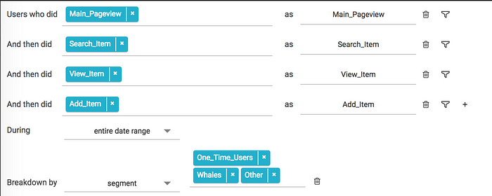
Creating a user funnel with unified data
Your dashboard can then display KPIs that include this enriched data, like customer LTV and churn, for example.
Turning to a Data Warehouse
Many SaaS companies understand the importance of data unification. The challenge is how to achieve it.
One way is by using a data warehouse, which can store all data across multiple channels in a unified manner (assuming an ETL process is in place). Companies can then build their SaaS dashboard on top of this warehouse using SQL queries.
Another option is to choose an analytics platform that provides a warehouse for you. Cooladata, for example, pulls data right from the source, taking care of unification and ETL in the process. This allows companies to create valuable dashboards right away.
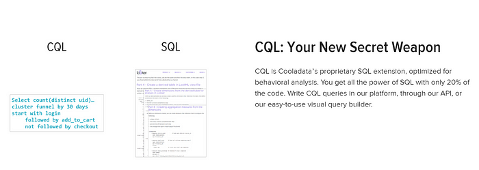
Cooladata’s CQL vs. SQL
With a data unification plan in place, your company now has the ability to pull reliable information into your dashboard. Which brings us to the next point: with many metrics available to measure, how do you know which ones to include on your dashboard?
Data Visualization That Matters and Drives Action
The truth is not all metrics are important for SaaS companies — in fact, many of them are a distraction at best (think vanity metrics). Your dashboard should only include those that truly measure your company’s growth.
We want to highlight the following core metrics every SaaS company should be monitoring.
Core SaaS Metrics
- Lifetime Value (LTV): The total value an average customer brings to your company over their entire time as a customer.
- Customer Acquisition Cost (CAC): The average cost for acquiring a new customer.
- SaaS companies should also follow their LTV/CAC Ratio, which compares lifetime value to the amount of money spent to acquire them. Strong SaaS companies should have a LTV/CAC ratio of 3 or higher.
- Churn: The percentage of customers who leave your company, typically calculated by month.
- Retention: The percentage of customers who stay with your company, also typically calculated by month.
- Average Revenue Per Account (ARPA): The average revenue from each account (customer).
- Monthly Recurring Revenue (MRR): The revenue a SaaS company expects to earn every month.
- Expansion: The amount of monthly revenue from existing customers. Account upgrades and adding new users to existing accounts are ways existing customers contribute to expansion.
- Time Series: How metrics change over time. Your dashboard should show your key metrics over several months so you can understand how your efforts (e.g. sales, marketing, development) are impacting growth.
Custom Behavioral Metrics
The metrics we’ve covered so far are all provide insights into the health of your company. Yet they’re overlooking an essential component to any SaaS company: the customer.
To optimize your business’s growth, you need to understand what users do to become customers and the value they deliver across the lifecycle.

Subscription funnel based on user behavior (at least 1 page view on Outbrain, Taboola, or Twitter)
Behavioral metrics do just that. Every analytics dashboard should include them to draw a deeper understanding of how customer behavior is helping or slowing your growth. Some behaviors you should keep track of include:
- Activated Customers: User sign-ups are great, but what does that really mean if new customers never use your product? You need to define what an activated customer means to you. This can be completing certain tasks, such as an onboarding training, or spending a certain number of hours spent using your product.
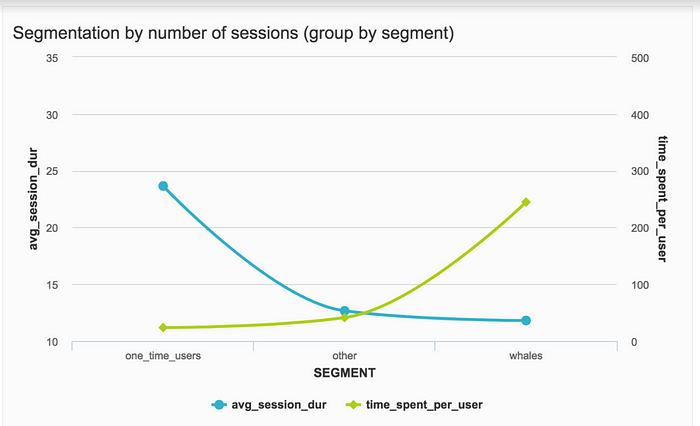
Behavioral metrics can reveal new insights for different user segments
- Browsers vs. Buyers: People can go through a variety of actions before becoming customers, such as browsing your company’s website or attending a webinar. Some may never become customers — knowing the ratio of the two can help indicate the effectiveness of your company’s website content.
- High vs. Low Engagement Customers: Monitoring low-activity and inactive users is valuable for several reasons. A sudden drop in user engagement may point to software issues. Inactive users may share certain qualities, such as location or belonging to the same industry.
- Paying vs. Non-Paying Customers: Some SaaS companies offer free trials or a free “basic” of their platform with basic features. Understanding who upgrades and when can help you better market your product against the competition. Similarly, understanding users who never upgrade can help you identify industries and customer personas that may not be worth pursuing.
Despite the importance of core and behavioral metrics, they’re not easy to calculate. For instance, let’s look at the simplest way to calculate CAC:
Average Marketing and Sales Costs / Average Number of Monthly Acquired Customers
Customers can come in from many channels, oftentimes after interacting across several (e.g. downloading a website guide, scheduling a demo, and clicking on an ad). Accurately calculating metrics means your data analytics tool needs to include the costs from these sources.
While the above metrics are important for every SaaS company, there’s no ignoring that every company is different. You may want to track a particular metric that other SaaS companies may not care about.
The key is picking a metric that truly serves as an indicator of your company’s long-term health.
North Star Growth Metric
As Sean Ellis, CEO and founder of GrowthHackers, explains, a company’s north star metric (NSM) is one metric chosen by a SaaS company that best captures the value of your solution. It’s the metric that tracks what customers get out of our product. Some examples include:
- Number of Nights Booked for Airbnb
- Total Time Spend Reading for Medium
- Monthly Active Users for Facebook
Considering what we know about these companies, their NSMs makes perfect sense. We can’t imagine Airbnb without bookings, nor can we separate Medium from reading posts.
That question should be asked back to your company: what’s the true value you deliver to your customers?
Because an NSM measures the true value of a company’s product, it’s something everyone can unite behind. Driving number of nights booked, for example, involves marketing (who promotes the company), development (who builds and manages the site), and others.
Including your NSM on your dashboard can literally serve as a guiding metric for anyone using it.
“Because a North Star Metric measures the true value of a company’s product, it’s something everyone can unite behind.”
Now that you have the information that matters to your business, your next step should be to jump into the underlying data to figure out what’s going on. Your analytics tool should allow you to do just this.
Otherwise, your metrics are just that: metrics that reflect the current state of your business. If metrics are strong, great! If not, there’s not much you can do.
Reports That Allow for Deep Ad Hoc Analysis
One of the problems with most dashboards, especially with those made from spreadsheets or stand-alone dashboard tools, is how little control you have with diving deeper into a metric or report. Dashboards should kick-off a deeper investigation into important metrics, not be treated as the final step of data manipulation.

In many cases, spreadsheet dashboards are only built to provide metrics, nothing more
Let’s consider an analyst that sees their company’s expansion metric this month is at an all-time high. A flexible dashboard allows the employee to click on the expansion metric and view the data behind it.
The data may include upgraded customers, expansion type, and the value of each expansion. The curious analyst may find most expansions came from account upgrades, which they can associate with the company’s recent pricing restructure.
“Dashboards should kick-off a deeper investigation into important metrics, not be treated as the final step.”
Cooladata’s Drillthrough Reports feature is one example of a dashboard that provides ad hoc analysis. Analysts can click on a report and “zoom” into another preconfigured report based on the same data. By directing analysts to the right information, they can continue their investigation without getting caught up in irrelevant data or metrics.
Yet how does the analyst know to investigate expansion in the first place? What about the dashboard prompts the analysts to notice something new and different with that metric?
To help make your dashboard actionable, you should keep in mind two factors: actionable reporting and visualizations.
Actionable Reports
Dashboard reports should help your team prioritize efforts and improve the metrics that matter to their business. This means more than displaying valuable metrics. The presentation of your dashboard should help tell the story you want to tell. Organization matters.
SaaS dashboards can be grouped in three ways:
- Operational Dashboards: Dashboards that track business processes, goal progression, and KPIs in real-time.
- Strategic Dashboards: Dashboards used mainly by leadership that focus on company KPIs. These dashboards can also include department KPIs to offer a company snapshot.
- Analytical Dashboards: Dashboards used to investigate trends and insights.
With a clear understanding of the purpose of your dashboard, you can orient your team’s thinking from the get-go. Tim Montgomery, President of TIMIT Solutions, LLC, suggests giving your dashboard the 5-second test: the person looking at your dashboard must feel good or bad within 5 seconds of viewing.
Montgomery explains that if the person doesn’t feel anything within that 5 seconds, the dashboard needs to be re-worked. In other words, your dashboard needs to mean something. The organization of your dashboard can help achieve this.
The “feeling” aspect of this test also makes sense. If your team members don’t feel anything upon looking at your dashboard, what would motivate them to dive into ad hoc analysis?
Visualizations
Leverage visualizations in your SaaS dashboard to clearly convey information for easy understanding and promote action. Some best practices to keep in mind include:
- Limited Design: If the design feature, such as a fancy border or metric header, isn’t helping the user understand the dashboard’s information, it’s more likely a distraction.
- Meaningful use of color: Colors should be used to help viewers spot meaningful information at first glance, such as trends or anomalous data points.
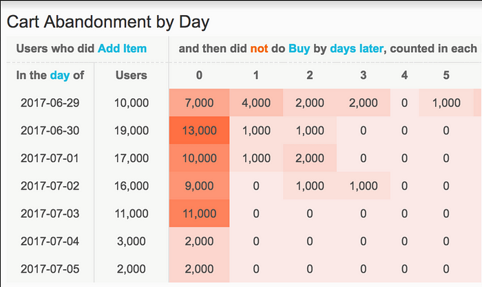
In this example, color is used to highlight days with higher numbers of cart abandoners
- Bar Charts: Bar charts can be used for representing metrics over time. Pie charts, though able to break down parts of a single metric, can only do so at one point.
“If the design feature isn’t helping the user understand the dashboard’s information, it’s more likely a distraction.”
By combining actionable reports with useful visualizations, your SaaS dashboard should enable your team to dive into ad hoc analysis to answer any question or curiosity. Some examples include:
- Creating a segment of users that did not convert after a free trial. Your team can then compare the actions of those users to the ones that did convert to see if you can find a difference.
- Create a segment of users who purchased based on an email marketing campaign. Your team can then do a retention analysis to see how many purchased again in the following months to identify which customers are receptive to certain kinds of offers
- Create a segment of users who downloaded a PDF on mobile. Your team can then take that segment and see how many converted to customers on desktop
Company Culture Focused on Data
With your perfect SaaS dashboard put together, you now face a new challenge: getting people to use it.
The downfall for many dashboards is that they’re never used, which can happen for different reasons. Perhaps the following sound familiar:
- Your current dashboard isn’t set up in a way to be consistently actionable. This can happen with dashboards that require a lot of manual updating, such as with spreadsheets.
- Your dashboard isn’t an active part of business operations. Teams and leadership know it’s there, but instead rely on their own resources for decision-making.
The first issue can be solved by following what we’ve covered so far. The second requires a shift in thinking at your company. Remember that dashboards are, after all, metrics pulled together by company data. By making data an important element of your company culture, you can position your dashboard as a valuable resource for understanding and acting on that data.
“Position your dashboard as a valuable resource by making data an important element of your company culture.”
SaaS Companies That Embraced Data
Yet how do you make caring about data a core part of your company’s culture? Let’s take a cue from some SaaS leaders and experts that have done just that:
- Darren Bruntz of eBay explains that data should be activated to drive all aspects of the company, from reporting to the customer experience.
- Jay Dwivedi, founder of Xinvest Consultants, recommends companies to measure everything that can be measured, retain all company data (even if it isn’t used), and make it clear to employees that no decisions will be made without data to back it up.
- Aron Ezr, CEO of OfferCraft, recommends training employees in data literacy so they can better understand dashboard metrics and make actionable insights.
- Gretchen Roberts, CEO of Smoky Labs, explains that companies can take a top-down or bottom-up approach to fostering a culture around data.
- Lior Ash, COO of mySupermarket, says his company focuses on real-time events to drive increases in all their KPIs
Making Your Dashboard Accessible
Employees that understand the importance of data will want to have easy access to your dashboard.
Consider the following to help make you analytics dashboard as accessible and shareable as possible for all stakeholders:
- Shareable Links: Ensure your dashboard can be shared with a link, which allows stakeholders to easily send links via email or text and bookmark them for later.
- Embed Your Dashboard: Embedding your dashboard into emails or your internal website can help keep your people up to date with the latest trends.
- Alerts: Trigger email alerts whenever there’s a major update on key metrics or reports on your dashboard.
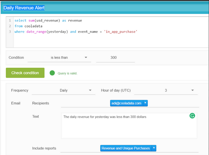
Setting up a daily revenue alert in Cooladata
Conclusion
To get the most value out of a SaaS analytics dashboard, you need to put thought and planning into what value you want to get out of it: what data do you want to present, the best way to present the data, and how every visualization can contribute to action.
Once you’ve done this successfully for one core SaaS analytics dashboard that details the performance of the entire company, create more custom dashboards that dive in deeper to specific areas of the business. Marketing, customer success, sales, and other teams can benefit from the focus a dashboard can offer.


